

Cartier found a work around quite some time ago and maybe they weren’t even the first to design a square ‘clock’:
(The roman numerals are nice, but notice the ‘circle’ between the numerals and the hands, almost like the circle from the ai)
lemm.ee migrant


Cartier found a work around quite some time ago and maybe they weren’t even the first to design a square ‘clock’:
(The roman numerals are nice, but notice the ‘circle’ between the numerals and the hands, almost like the circle from the ai)


such a variety of failure modes
What i find interesting is that in both cases there is a certain consistency in the mistakes too - basically every dementia patient still understands the clock is something with a circle and numbers and not a square with letters for example. LLMs can tell you cokplete bullshit, but still understands it has to be done with perfect grammar in a consistant language. So much so it struggles to respond outside of this box - ask it to insert spelling errors to look human for example.
the ability to “see”
This might be the true problem in both cases, both the patient and the model can not comprehend the bigger picture (a circle is divided into 12 segments, because that is how we deconstructed the time it takes for the earth to spin around it’s axis). Things that seem logical to use, are logical because of these kind of connections with other things we know and comprehend.


Removed by mod


By far the best, but still off. These three were loaded in the same order as i post them:
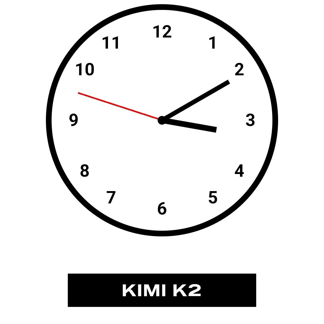
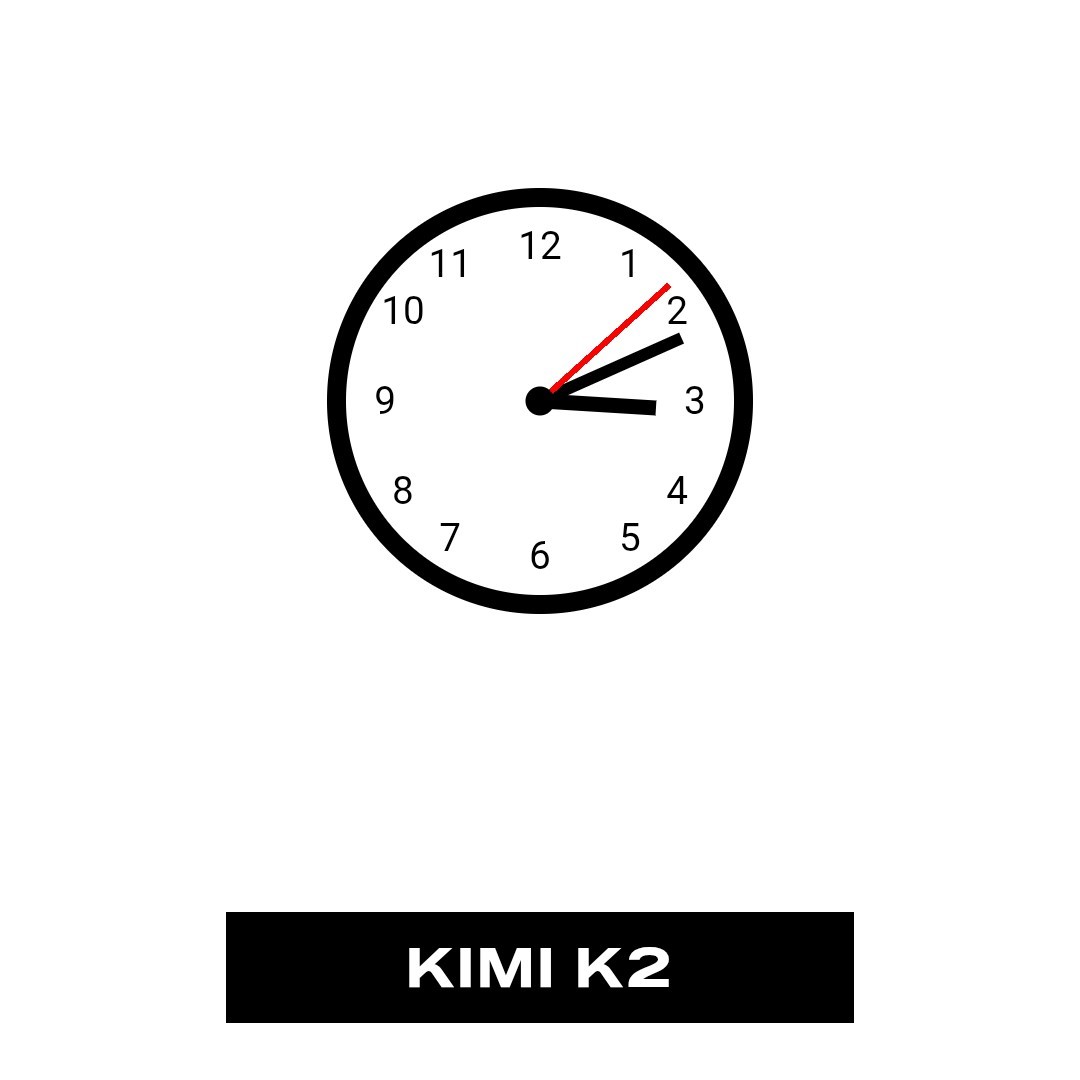
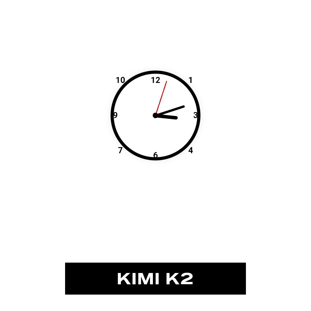


I thought the same, until it refreshed and it got worse and it refreshed and it was different but still bad. These three were loaded in the order as posted:
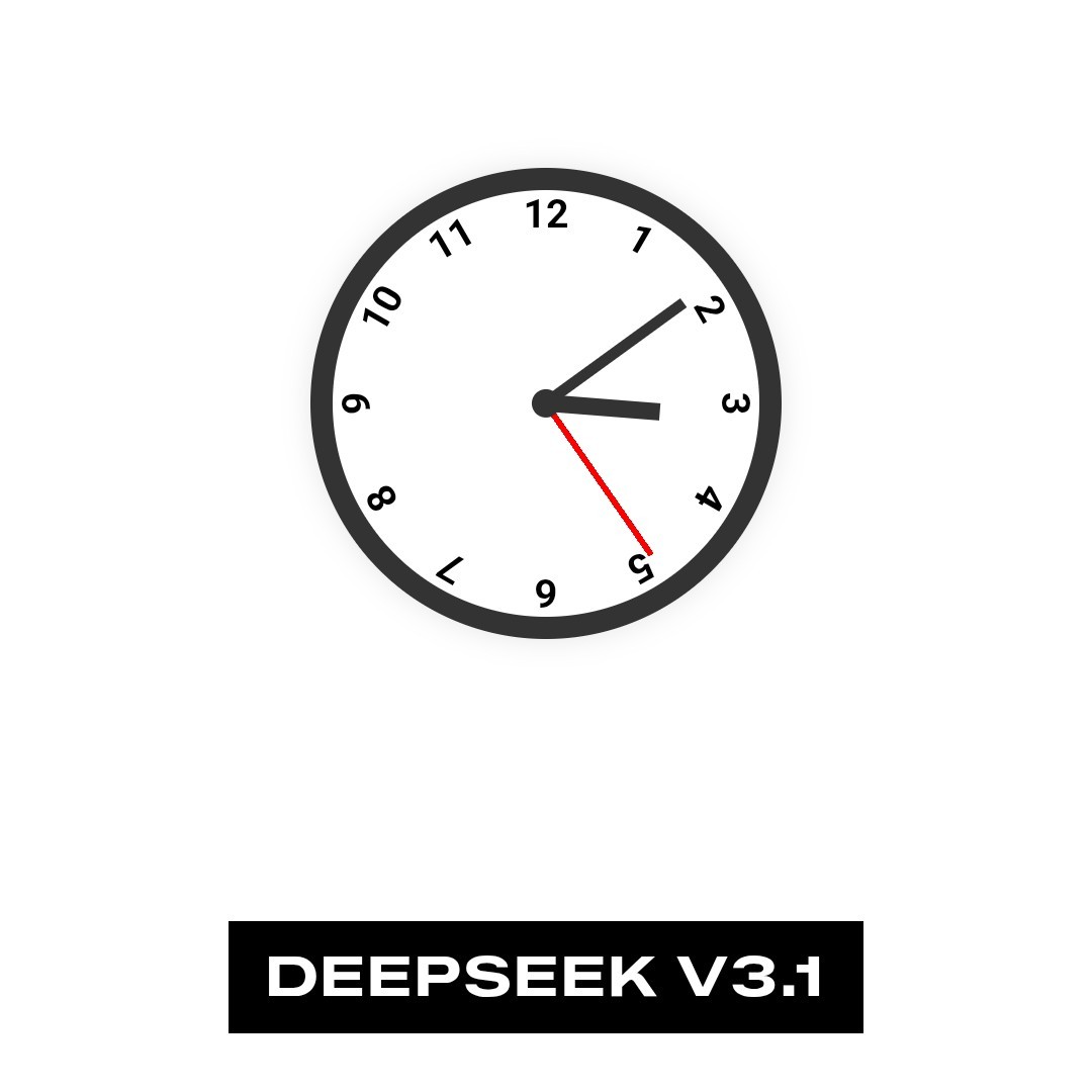
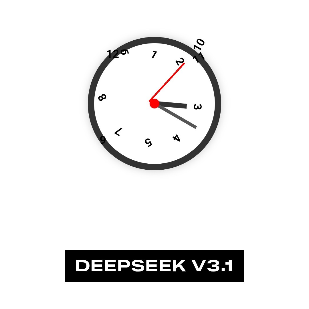
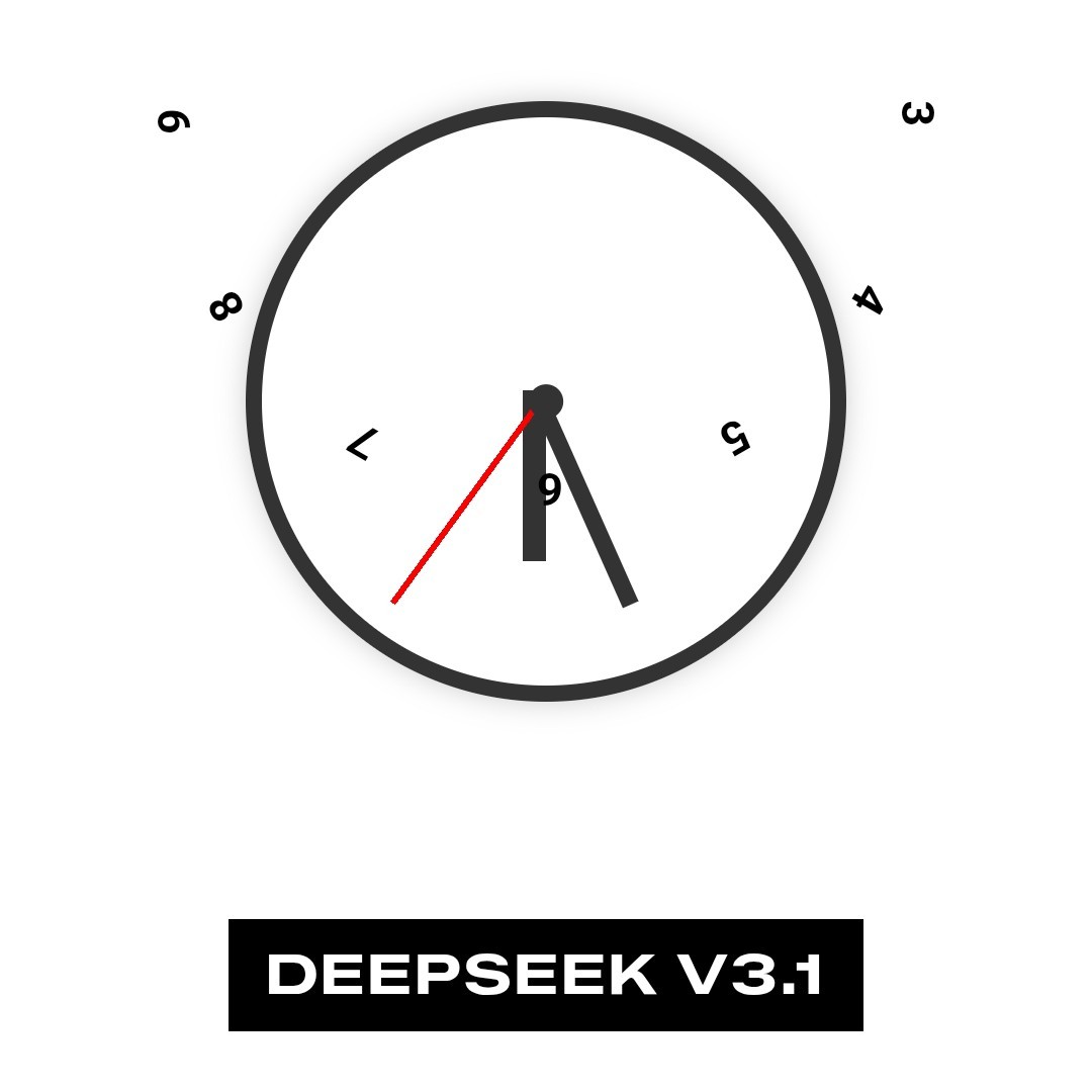


short looping videos
is being worked on by the team behind Pixelfed, it’s not on ActivityPub as of yet but it is intended to become part of the fediverse: https://loops.video/
I like the second one a lot, especially how the upper and bottom numerals face the floor and the left and right ones face towards the center, and to allow for that there has to be a sudden flip from 3>4 and 8>9. But the indices are not playing by the square-clock rule and unlike the cartier one form a regular oval shape.
I like how the upper one had to find a way to make clear which indice represents the numerals - it really shows the problem in projecting the circular movement of the hands into a rectangular (thanks, that’s the right word) shape.
It think most analog clocks/watches will give you an old-timey whiff much more often than not, just because there is a more new-timey alternative. I went looking for some watch faces for smart watches, but couldn’t really find any interesting one. Most are either digital numbers or a round clock on a rectangular display.
Neither of those interest me like the Cartier tank, which I find really ugly watches to be honest. It’s just this double outlined rectangle(-ish shape) which is unevenly split into 60 boxes that I like (seen below on the first, third and fifth watch).